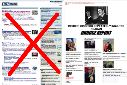
Techmeme has redesigned. Drudge Report is now indisputably the web's ugliest news site
 In the beginning, links on web pages were underlined,
because that let us know they were links. And it was good.
But all those underlined words started to afflict the eye,
particularly on pages with
many links.
Over time many web sites, including news sites,
abandoned underlines altogether, and more recently
even Google News dispensed with all their underlines.
By 2012, Drudge Report and Techmeme were one of the few notable holdouts. But that's ending now. Sorry, Matt.
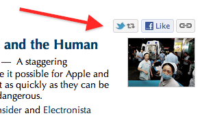
Today, we're introducing a new design that leaves behind underlines and other elements that made Techmeme feel more cluttered and encumbered. Among the major changes: all sidebar navigation has moved to the top of the page, convenient share buttons appear when the mouse pointer passes over headlines, and most Sponsor Posts now appear "above the fold". Joining Techmeme's new main page is an About page that's a good starting point for anyone new to Techmeme.
 Other new features are self-evident and shouldn't require elaboration here.
But one is worth pointing out: our new Twitter share button
is not the standard "tweet" button, but rather a "retweet" button for
@Techmeme's tweet corresponding to the news item.
In most cases readers don't want to bother editing the headline of the story they're sharing,
so we opted for the more natural retweet option.
Acknowledgements: Nearly all of Techmeme's editors pitched in at various iterations to give substantial and helpful feedback, and our newest news editor Jarrod Cugley proved his versatility by handling most of our graphics. As usual Omer joined me in performing the actual dev work. We were also very fortunate to receive continuous guidance from Johnnie Manzari, who offered mock-ups, screenshots, and other direction. Many of the wise and critical decisions in this effort came from his example or recommendation, and I'll add as a corollary that any unwise or offensive aspect is something he probably advised against.
Is this design coming to Mediagazer and other Techmeme sister sites? Eventually, yes, though it's starting just at Techmeme. Mediagazer in particular isn't as afflicted with the uglies in the first place, given that its area of coverage leads to less link-heavy story clusters. But it will nonetheless benefit from a refresh. Techmeme's redesign will not, however, extend into its past. One curious yet fun practice we've upheld here is that old archives maintain their old look.
We hope you'll like Techmeme's new look more than the folks I polled yesterday appreciated the old, but if anything seems broken or especially wrong, send a note and we'll have a look. And if any of you know Matt Drudge, please tell him it's okay to remove the underlines.

 Mediagazer
 memeorandum
 WeSmirch